The Power of Typography in Packaging Design That Connects
September 05, 2025
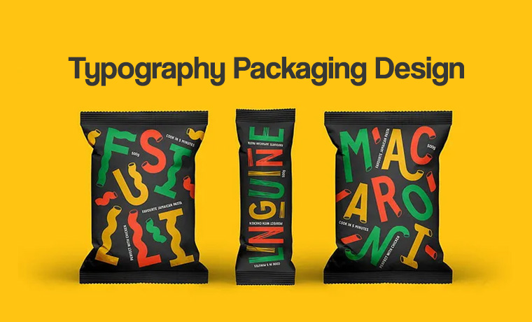
Think your packaging speaks for itself? Think again. Should you use typography when your packaging design is speaking louder and conveying your message? Yes, of course. The selection of typography can make or break your packaging design.
Typography is as important as visuals—it can grab more attention, evoke emotions, and lift your brand persona. The right font choice for packaging reflecting your brand image can truly connect with your audience and make a big difference.
The packaging that can take your product package to new heights combines two things:
- Design
- Text
To achieve your typography in packaging design goals, look into your brand needs, product characters, trends, ideas, or innovations.
Ready to turn your boring packaging into a conversation starter? Hang in there.
This blog is diving into the typography packaging design with the latest trends and technicalities to help your brand shine like a diamond on the shelf.
What is Typography in Packaging Design?
Typography in packaging design is the strategic use of font styles, sizes, colors, and layouts to communicate product information and brand identity. When used correctly, typography makes packaging not only readable but also emotionally engaging. Bold fonts in typography can create a big impact, evoke trust, and influence purchasing decisions.
The products ultimately stand out on competitive retail packaging shelves. From font hierarchy to color contrast, typography turns basic packaging into a visual storyteller that connects with consumers at first glance.
The Primary Purpose of Typography Packaging Design
The major purpose of typography packaging design is to mesmerize customers and help them pick your product while leaving others behind. You are losing a selling chance if customers ignore your product when they are passing by it.
Positioning a Brand
Typography sets your brand's position in the way you want to sell your products. The right selection of fonts helps customers perceive your products and tell them what type of brand you are presenting.
Setting Your Brand Apart from Others
Typography differentiates a brand from others and encourages customers to notice it. Customers are more likely to recognize a brand when they notice its products in unique typography. The composition of the right type of typography plays a key role in a distinctive brand mark.
Defining Your Product
Define your products using attractive visual elements combined with carefully selected typography to grab the attention of a crowd and enhance your packaging appearance.
All these factors work together to differentiate your brand from the competition, and your product packaging looks fabulous on the shelf.
Capture More Customers’ Attention
The basic purpose of typography is to grab more attention of customers from a distance. Even if customers are feet away the objective is to attract customers and encourage them to pick the products and buy it instead of passing without noticing.
Hierarchy of Essential Information on Product Packaging
In a typography packaging design, hierarchy sets your design principles and visual structure of product information. There are three phases:
1. Primary Information
The details that consumers notice first are the brand name or logo. This creates a brand identity. The product name should be clearly shown and tell consumers what the product is. You can add a standout message like "Sugar-free" or "New Formula". This can capture more attention from onlookers.
2. Secondary Information
This includes product type or flavor, quantity, and a brand slogan. It adds more context and supports the primary message. A brief product description like "Natural Almond Butter" is provided on the packaging. This important set of details attracts customers.
3. Tertiary Information
The key information in this hierarchy includes written material in small that is often ignored. It covers information like ingredients, usage instructions, nutritional and contact info, often on the back of the packaging.
It includes an arrangement of elements such as product information, typographic texture, typography background, packaging styles, and brand names to guide customers about the product name, features, benefits, and the brand introducing that particular product. Using appropriate fonts, sizes, and colors is also a part of the hierarchy to make your products known to the target audience.
Primary Technicalities Involved in Typography Packaging

It is time to work on its technical aspects. You can finalize the packaging design with the help of product packaging software and forward it to the production process. Then it’s time to work on technical aspects.
Limit Font Size
The first technical point about typography packaging is its font limit. Using 1 or 2 fonts in packaging is very common. Using more than 2 fonts may make your packaging overdesigned.
Readable Font
Ensure the typeface on the packaging is visible and the font is easy to read to help customers with what they need. Consider using upper and lower-case fonts to grasp customers' eyeballs. Choose a font resonating with your brand to enhance product appeal and convey a message.
Packaging Layout
The typography composition of the product information printed on the front in primary and secondary is the same on all other sides of the product packaging layout. For a dark typography background, use a light-colored font. If the font color is dark, the background color should be light.
Font Alignment
Another thing is the font alignment. Create a balance in font alignment with an easy-to-read arrangement on the right, left, or center.
Font Scale
Besides this, consider the font scale for primary, secondary, and tertiary product information. Use a font size of 14pt for regular text, following the latest trends appropriately.
Top Typography Packaging Design Examples and Trends

The are many types of packaging designs that are working best with the latest trends in packaging styles. They aim to give fantastic typography design ideas about a logo and packaging design. Following these trends, countless opportunities are found for a brand to mark its identity and shine as a start. For this, you must know your target audience and business needs, then work on typeface, graphic design packaging.
1. Clear Typography
This is an old but effective trend, has been used for many decades, and plays an essential role in helping customers perceive the value of your products and read product names from a distance. Many brands are following this trend. They are using matching colors with eye-catching designs to differentiate their brand.
2. Minimalism
Minimalist typography focuses on simplicity, clarity, and readability through carefully selected fonts and their usage. It is about scrapping unnecessary elements to create a clean, modern, and impactful visual message. With a small element, it leaves a big impact.
3. Retro Typography
It is a visually styled retro font that takes you back to the aesthetic designs of past decades. It has bold, distinctive, and playful letterforms. This trend was popular in the 1970s, 1980s, and 1990s and was often used to create distinctive graphics. You can use this trend in the current year to have a pleasing impact on your packaging design.
4. Bold Packaging Design
This trend is emerging in various captivating graphic designs, bold elements, and expressive typography to create a breathtaking packaging experience that customers never forget. Customers do not spend time noticing a product, which is why this trend tends to attract customers by leaving a prominent brand design and impact.
5. Textured Packaging
It is a design technique that incorporates tactile elements to enhance the visual and sensory experience of the product. This typographic texture can create a more engaging and memorable interaction with consumers.
6. Geometric Shapes
Entering the world of geometry, we find various geometric shapes. When these shapes are used in the packaging, combined with typography, they create visually appealing and modern aesthetics. It creates a typography picture in unique shapes like circles, squares, triangles, and polygons. A brand can use these distinct shapes to create a hierarchy guide for customers about products.
Read More: 10 Revamping Packaging Design Trends That Are Changing The Game In 2025
Why Are Shorter Brand Names Better For Packaging And Advertising?
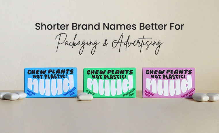
A longer brand name is hard to remember, and sometimes you misspell it. However, a shorter name has many advantages in packaging and advertising, like:
- Does not sound awkward or misconstrued.
- Brand names with short lengths are easier to remember and understood by a wider audience.
- Likely to stick in the customers’ minds.
- Takes little space on the packaging and allows other information to be added.
- It can make a big impact on social media and capture a global audience.
Final Thoughts
If you need an appealing typography packaging design to surpass, work with a skilled designer or host a design contest to get typography design ideas that can make your product stand out.
To bring your vision to life, free design support under a team of professional designers at Custom Product Packaging is available. Our graphic designers are experienced in designing your packaging with typography, following the latest trends to make your products look amazing on the retail shelf, communicating with customers, and lifting your brand.
Please email us at orders@customproductpackaging.com to take advantage of our free design consultation and make your typography packaging jump out.
