Colors are an important part of design and easily catch the eye, Right? What color system do you think is perfect to achieve true colors in your design? Do the colors look real when printed? As a designer or manufacturer, don’t you want your design to vibrate and match its colors fully? What color system should you choose? Wait and read on!
Pantone Matching System takes center stage to get your desired color match. This blog will help you understand PMS, provide a brief history, and discuss its advantages and disadvantages. You will also learn its applications and comparison with other color systems. Without further ado, let’s kick-start our discussion.
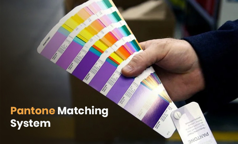
What Exactly is the Pantone Matching System?
Pantone matching system (PMS) is a standardized color reproduction system. This color system ensures true color consistency and accuracy in design and print. It means that the design is printed in the same colors as it looks even if different manufacturers print it.
This ensures consistency and accuracy in color across industries such as printing, design, and manufacturing. Each color in PMS is assigned a unique number. This number value acts as a universal language for colors and refers to the exact same shade. PMS is used for packaging, branding, textiles, and other color-sensitive applications.
The Different Colors Palettes in PMS
PMS has various color palettes. Each color palette lists thousands of colors and tones. These color palettes used in various industries are:
- Pantone Solid palette
- Process palette
- Textile palette
- Plastic palette
- Goe palette
Who Created the Pantone Matching System?
The journey of Pantone started when it was established in 1950 as a commercial printing company by two brothers who were advertising professionals. In 1963, the Pantone Matching System (PMS) was created by Lawrence Herbert. He later purchased the company, and it emerged as Pantone Inc.
Herbert introduced this standardized color–mixing system using a set of pre-mixed inks. Each color in this system was identified by its Pantone number value. This helped designers and printers to achieve accuracy in colors when matching colors across different materials.
Pantone - 1970 to 1986
Pantone expanded its operations by the 1970s. It has reached various industries, such as plastics and fashion. Pantone was on its way to digitization in 1980. This innovation gave birth to Pantone Color Institute in 1986. Later on, digital tools made Pantone's color-matching process more accessible.
Pantone - Today
Pantone offers thousands of colors in different formats for a wide range of industries.
Why is PMS So Important in Various Industries?
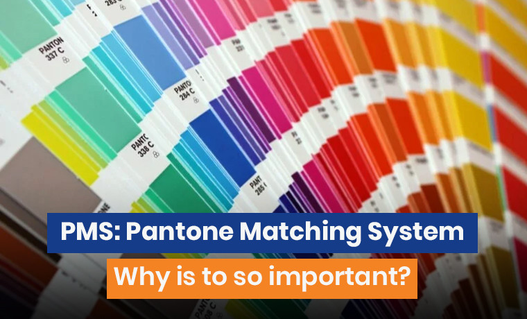
Colors significantly play a key role in various industries, such as packaging and printing. PMS, in this case, offering its values is building a brand image. It offers:
- Persistent branding
- Specific color reproduction on different materials like cardboard and plastic
- Striking graphics and vibrating logos to mesmerize customers
Tiffany & Co. - a brand known for its luxury jewelry, gifts, and accessories. They specifically use PMS 1837 for their iconic jewelry boxes consistently for the same shade of blue worldwide. This helps customers instantly identify the brand.
Using PMS ensures that:
- Brand colors remain consistent
- The design keeps its professional appearance
Advantages and Disadvantages of the PMS
Pantone Matching System offers different advantages and disadvantages.
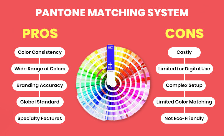
Pros:
Below are the pros of the Pantone Matching System.
- Color Consistency
- Ensures precise and consistent color matching on different materials and prints.
- Wide Range of Colors
- Offers a vast library of unique and specialized colors not achievable with CMYK.
- Branding Accuracy
- Ideal for maintaining brand identity with exact color reproduction.
- Global Standard
- A universally recognized system ensures color consistency worldwide.
- Specialty Features
- Supports metallic, neon, and other specialty colors not available in CMYK.
Cons:
The cons of the Pantone Matching System are as follows:
- Costly
- Spot colors require additional inks, which can increase printing costs.
- Limited for Digital Use
- PMS color codes are primarily designed for print, not digital screens.
- Complex Setup
- Requires specific inks and plates that add complexity to the printing process.
- Limited Color Matching
- Physical swatch books are expensive and need regular updates due to fading.
- Not Eco-Friendly
Using additional spot colors increases ink waste and environmental impact.
How to Accurately Find and Match Pantone Color Shades
Follow these steps to achieve the closest Pantone colors for packaging.
- Use the Pantone Connect tool to match the digital colors.
- Compare printed colors with a physical swatch book.
- Use online color-matching tools like Adobe Photoshop.
Also Read: What Color Model is Used in Printed Designs?
PMS VS. Other Color Models
It’s time to compare PMS with other color models. Let’s look into this.
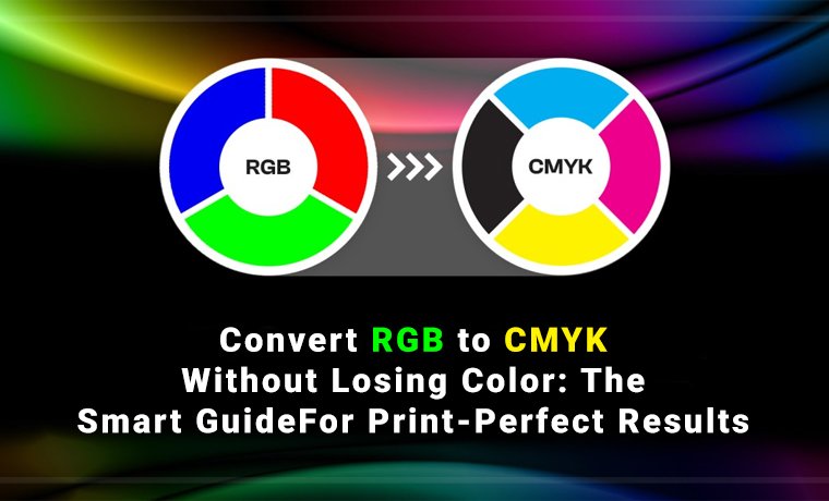
PMS vs CMYK:
| Features | PMS | CMYK |
| Color Model | Spot color system (uses pre-mixed inks) | Process color model (mixes four inks to create colors) |
| Color Accuracy | Precise and consistent. Ideal for logos and branding. | Less precise. Colors may vary between printers/devices |
| Color Range | Wider range including metallics and neons | Limited to combinations of 4 inks |
| Printing Process | Requires separate plates for each spot color | Uses a single plate with layered ink dots |
| Print Compatibility | Primarily for print; not natively supported on screens | Designed for digital and print |
| Uses | Best for logos, branding, and single-color projects | Ideal for photos, full-color designs, and general print |
| Environmental Impact | Higher wastes | More efficient to reduce waste |
| Cost | More expensive due to additional ink setups | Cost-effective for full-color prints |
PMS vs RGB:
| Features | PMS | RGB |
| Color Consistency | Ensures consistent and standardized colors over different materials | May vary slightly between different screens and devices |
| Color Range | Features a set of predefined colors | Creates a vast range of colors by mixing red, green, and blue |
| Color Model | Subtractive | Additive |
| Printing Process | Uses specific premixed inks for each Pantone color | Not used directly for printing. Colors need to be converted to CMYK for print |
| Application | Ideal for spot color printing, where color accuracy is essential | Perfect for digital displays and applications requiring a wide color gamut |
| Best for | Branding, logo design, and precise color matching for print | Digital screens, such as monitors, TVs, and devices |
Bottom Line
Pantone Matching System (PMS) is a standardized color reproduction system. It is indispensable to ensure color consistency. The primary purpose of PMS is to facilitate true color communication in printing, textiles, and graphic design.
Whether you are a professional designer or a newbie, Custom Product Packaging - the reliable packaging manufacturer can help you match colors accurately. Simply drop us an email at orders@customproductpackaging.com to get the desired colors you really want.
Frequently Asked Questions
It is a standardized system of identifying and reproducing colors.
Pantone updated its Matching System in 2022 by introducing new base inks and adding 224 new colors.
Use a digital tool like Adobe to find the closest swatch.
Use a tool like Adobe Illustrator to find the closest Pantone color values after inputting the RGB/CMYK values. Convert digital colors to phone codes by entering the values into an online tool.
It ensures consistent color reproduction across different materials and processes.
No, it is not.
No. It is used in print and design.
Yes, you can get paint matched to a Pantone color.
CMYK is a suitable substitute for Pantone.
2,161 solid colors come in a Pantone swatch book.