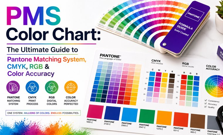
PMS Color Chart: The Ultimate Guide to Pantone Matching System, CMYK, RGB & Color Accuracy
May 06, 2026
Have you ever created a design, sent it to print, and then realized that your brand color has returned in a totally different shade? Well, it is simply a colour-matching failure, and this mistake is not as rare as you might imagine.
But why did it happen? The answer lies in the Pantone Matching System (PMS), which is a world-standardized color reference chart utilized by designers, printers, and packaging manufacturers to ensure the exact reproduction of the color, every time.
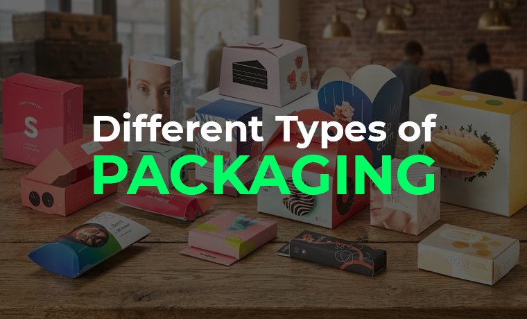
Strategies for color can seem like a secret language that only print enthusiasts can decipher. However, everything becomes much smoother once you "get it," including digital design, packaging, and branding. This guide is a detailed discussion about the PMS color chart, its types, and its applications.
What is a PMS Color Chart?
A PMS color chart - also known as the Pantone Matching System color chart - is a standardized physical or electronic reference manual of hundreds of different numbered ink colors.
In simpler words, you can call it a universal color language that ensures the exact same shade appears everywhere, whether it’s printed in Pakistan, the USA, or Japan. How? Because all colors possess their own code, which can be reproduced the same by any printer in any part of the world using already mixed Pantone inks. Remember, instead of creating colors by mixing inks, PMS colors are pre-formulated.
For instance, when a company orders the Pantone 286 C to be used in their logo, a printer in all parts of the world will print the exact blue color - no explanation or translation needed.
Further, PMS charts in physical form are printed on coated and uncoated paper stocks - since the same ink is not used on different surfaces, the results are different.
For those who are confused between PMS vs Pantone, BOTH ARE THE SAME!
Best Use:
- Brand logos
- Business Stickers
- Packaging design for die-cut boxes
- Corporate identity systems
- Luxury printing jobs
Types of PMS Color Charts
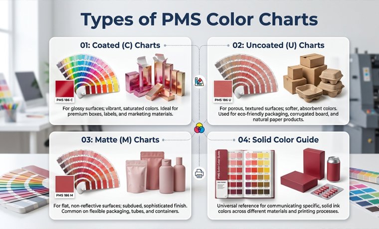
Pantone manufactures a variety of chart types - each with a particular substrate, printing process, or application. Selecting an inappropriate guide will cause color differences in print.
- Coated (C) Charts:
Typically used on coated or glossy paper stocks, colours seem to be brighter and richer + Perfect for retail packaging, cosmetic boxes, and cartons.
Example: Pantone 186 C.
- Uncoated (U) Charts:
These are intended to be used on uncoated, matte, or natural paper. When used on uncoated stock, the ink is a little less sharp and vivid. Pantone 186 U will have a very different appearance compared to 186 C - the same formula, different surface appearance.
- Matte (M) Charts:
Specially tuned to matte-coated surfaces + Rarer, but are needed in high-end matte display boxes.
- Solid Color Guide:
The usual reference of PMS in spot printing, it has more than 1,800 solid colors of Pantone. These colors are used for logos, brand marks, and base colors of packaging.
Tip: Pantone ink, which appears on coated paper and uncoated paper, is quite different. On coated stock (C suffix), the deep navy will be seen to be lighter and cooler, on uncoated board (U suffix). The solution is to always demand a physical drawdown - a little test print of your PMS color on the actual substrate on which you will print your package. Do not accept a PMS colour on a screen preview!
How Does a PMS Color Chart Work
The Pantone Matching System is based on three fundamental concepts: coded codes, colors in mixes, and a universal production formula. This is how each of the components works in the actual printing environment.
Unique Color Codes
All the colors within the Pantone system have a specific numeric code with a suffix. Pantone 186 C refers to color number 186 in a coated paper. Pantone Black C refers to a black on coated paper that is formulated by Pantone, which is richer and more intense than the ordinary process black.
A number removes subjective descriptions of colors, such as bright red or navy blue, and instead, provides a fixed, reproducible reference.
Pre-Mixed Ink System
Contrary to CMYK, where four base inks are applied overprint on a different pattern at varying dot values, the Pantone inks are mixed in a precise formula and then sent to press. An ink formula exists for each PMS color - a recipe of the precise proportions of Pantone base pigment.
Standardized Printing Process
The same Pantone formula will result in the same hue on various printers and nations, provided that they are loaded with the correct substrate and ink system. It is this standardization that renders PMS critical in managing global brands.
Example: A multinational brand is packaging its goods on five continents and is able to keep the color the same on each carton.
Convert Pantone to PMS Pantone Connect
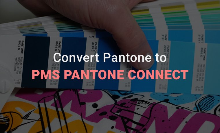
Now things get digital.
A technology (plugin + app system) called Pantone Connect assists designers in searching and matching Pantone hues, then converting colors between systems, and finally syncing colors in Adobe Illustrator, Photoshop, etc. (inside your choice of design software).
You choose a Pantone color instead of speculating, and Pantone Connect provides you with the closest PMS match as well as its RGB value and CMYK equivalent.
Read More: Exploring the World of Digital Printing: Guide 101
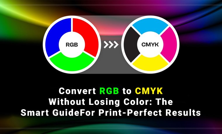
Translate Pantone to RGB (for Digital Designers)
In essence, Pantone to RGB translation transforms print-based color systems into a digital version intended for screens.
Why is this important? Because screens use light instead of ink, specifically: Blue, Green, and Red (RGB). Therefore, designers can visually approximate brand colors in digital spaces via a Pantone-to-RGB conversion.
Additionally, it facilitates a smoother transition between print and digital branding by showing how a logo or identity will appear on websites, mobile applications, social media, and UI designs. However, there is a significant drawback: because RGB relies on light emission rather than actual ink mixing, it is unable to accurately reproduce every hue in the Pantone Matching System. This implies that when shades are transferred from print to screen, some may change somewhat.
Rather than flawless color duplication, Pantone to RGB conversion is actually about visual approximation and uniformity across platforms.
Applications of the PMS Color Chart in Packaging
Pantone Matching System is not confined to a single type of packaging. PMS is the standard wherever the color of the brand must be the same, secure, and reproducible. It is used in major packaging industries like these:
| Packaging Type | Typical PMS Application | Film/Substrate | Key Benefit |
| Food Packaging | Brand color on snack boxes, bakery cartons, frozen food sleeves | Coated SBS board | Color consistency across mass production runs |
| Cosmetic Packaging | Signature brand color on boxes, tubes, outer cartons | Coated & matte paperboard | Premium, precise color for luxury positioning |
| Retail Boxes | Logo color, accent colors, background panels | Coated or uncoated cardboard | Shelf-ready visual identity; impulse purchase trigger |
| Luxury Packaging | Metallic PMS, specialty finishes, brand base color | Premium coated stock | Exact color signals quality and exclusivity |
| Pharmaceutical | Brand identifiers, safety color coding | White-coated board | Regulatory compliance; critical brand differentiation |
| Electronics Packaging | Product line color coding, brand marks | Coated corrugated or board | Multi-SKU color separation; product family cohesion |
Should I Use RGB or CMYK for Illustrator?
One of the most common design concerns is this one, and the solution is actually very straightforward.
The RGB color option generates brighter and more brilliant colors on screens. You should use it for digital tasks like social media postings, websites, and apps. However, because CMYK was created especially for physical printing operations, it works best for print material like brochures, packaging, and flyers.
The main distinction is that CMYK is more constrained yet suited for precise printing outcomes, whereas RGB has a far larger color spectrum.
In Adobe Illustrator, you should always set your project to CMYK mode if it's going to be printed, and RGB if it's going to be used digitally.
Tip: For optimum color versatility, start your branding or design work in RGB. Depending on your manufacturing requirements, adapt it to CMYK or PMS later. This is a wise professional suggestion!
Read More: In-Depth Guide to CMYK Printing: Explore More
Conclusion
Whether it's determining the signature color of your brand or making sure that every batch of packaging is exactly as you want it to be, Pantone Matching System ends the mystery that results in costly reprinting, brand drift, and disappointment at the shelf.
You need to order a Pantone matching system CMYK conversion to run a digital print, you want to use coated chart references or uncoated chart references, a metallic PMS to package luxuriously, or you need to decide on color confidence - it is all a vote in favor of color.
Custom Product Packaging is doing work to Pantone standards on all projects. That's why our boxes ensure 100% accurate color reproduction. Provide us with your brand colors, and our experts will do the rest, including PMS specification and press-ready proofs.