Pantone Vs CMYK Colors: What are the Key Differences?
September 05, 2025

Color schemes always impact your design project when you print. Whether it is RGB, CMYK, or Pantone colors, only the right color choice can help you achieve the desired printing results. The demand for achieving color consistency and high-quality print to build a brand's identity is rising. Consumers prefer top-quality print that leaves a lasting impact.
What’s the Pantone definition? What does CMYK mean? What is CMYK Printing? Which color model is better for printing? It's a little bit confusing when it comes to choosing the right color-matching system to print your packaging material. Fret not.
This blog will thoroughly explain Pantone vs CMYK colors and compare them to help you decide which color model is suitable to meet your needs. We will also explore the best tools for CMYK to Pantone matching system conversion to make the right color model choice.
Here you go!
What are Pantone Colors?
The Pantone is also known as the Pantone Matching System (PMS). This color-matching system ranges from various colors to paint swatches that come in diverse shades and depths and maintain color consistency. The distinct shades are created by mixing from pallets of 14 color bases. Each color in this system comes with a particular method that involves a certain amount of ink.
It helps to understand the specific color to be used no matter where you are. A specific allocated number lets you pick a color from the Pantone model. Pantone colors are popular in color communication, matching, inspiration, and maintaining consistency. They are suitable for brands that want to print the exact logo or design for a strong brand identity.
Examples Of the Top 6 Brands Using Pantone Colors
Here are some examples of popular brands that utilize Pantone colors to establish a unique brand identity.
1. Tiffany & Co
An iconic American luxury jewelry and specialty retailer that uses PMS color 1837 Blue.
2. John Deere
A classic combination of distinctive green (PMS 364 C) and yellow (PMS 109 C) to maintain consistent branding.
3. McDonald's
Both the yellow (Pantone 123) and red (Pantone 485) colors are used in McDonald's branding.
4. Cadbury
The distinctive purple used in Cadbury's packaging is Pantone color 2685C.
5. Barbie
A popular doll brand "Barbie" uses a shade of pink with a specific Pantone color (PMS 219C) commonly referred to as "Barbie Pink".
6. Coca-Cola
Coca-Cola is instantly recognizable and uses Pantone colors (PMS 484) for Coke Red.
Coated Vs. Uncoated Pantone
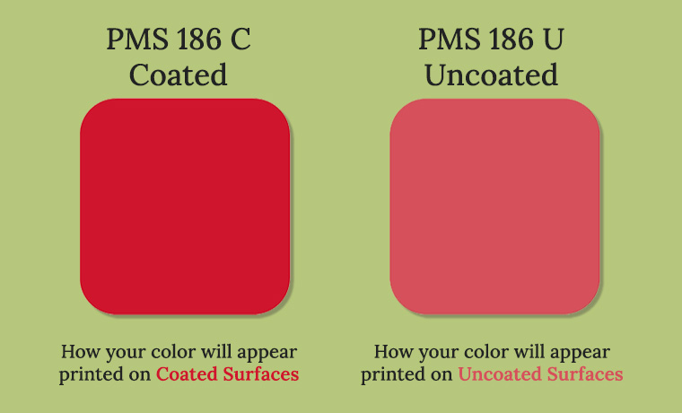
PMS (Pantone Matching System) is widely used in the printing industry. Pantone colors come in different finishes. Coated and uncoated Pantone are the most popular finishing options.
Here, the appearance of PMS depends on the usage of the printed paper. This is where the role of the terms coated and uncoated comes in.
Coated Pantone
Containing a shiny finish on coated paper, the ink sits on the top of the coating. The ink is absorbed in a minimum amount, which results in brighter, more saturated, and vibrant colors. It is suitable for printing brochures and magazines where high-gloss prints are required.
Uncoated Pantone
As the paper is uncoated, it is more ink-absorbent. Compared to Coated Pantone, which absorbs less ink, Uncoated Pantone absorbs more ink on the paper, making colors dull and saturated. This uncoated Pantone is suitable for stationery and letterheads where a classic look is required.
When to Use Pantone Colors?
Achieving color consistency, accuracy, and uniqueness is possible using Pantone colors. Here is the breakdown of when to use them.
Branding
It is ideal to print a logo on packaging, custom boxes, and signage.. Pantone colors are good for printing logos, business cards, and other branding materials where color consistency is essential.
Specialty Projects
Pantone colors offer a wide range of colors, from metallics and fluorescents to pastels and neons. This can help to create eye-catching designs. You can choose Pantone colors for premium packaging or luxury invitations.
High-Quality Prints
Pantone ensures the exact color reproduction. It is perfect for projects that require color precision and quality. You can pick Pantone for premium brochures or annual reports.
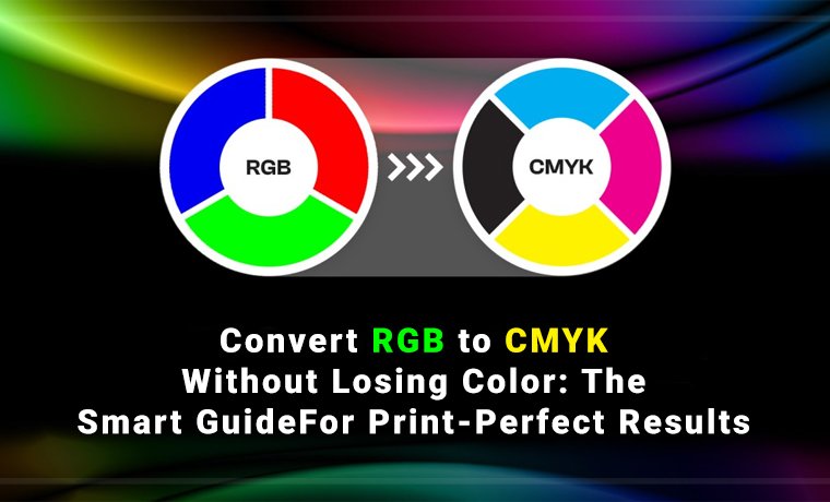
What are CMYK Colors?
The CMYK stands for Cyan, Magenta, Yellow, and Key (Black). This printing model utilizes four main inks to create a diverse spectrum of colors and tones through the overlap of dots.
What is CMYK Used for?
CMYK is perfect for screen printing and color printing. By adjusting the proportions and layering of these inks, printing professionals can achieve a diverse array of colors, making CMYK an essential model for creating high-quality printed materials.
Cost-effective Color Printing
This CMYK is an economical and efficient printing solution for printing packaging, logo designs, photographs, brochures, business cards, posters, wraps, stationery, signs, and magazines that require multiple colors.
When to Use CMYK?
Tons of opportunities are available to help you use CMYK colors.
Full-Color Printing
CMYK is ideal for projects with photographs or multi-color designs. It can include brochures, hang tags, magazines, posters, and packaging.
General Printing
CMYK is more practical and cost-effective when your project does not need exact color matching.
Offset and Digital Printing
Most printers use CMYK as a default color model to ensure better color consistency when printing.
Read More: Soft Touch Lamination in Packaging and Print Finishing
Key Differences Between Pantone and CMYK Colors
Comparing Pantone with CMYK enables you to understand the importance of both color models. Both models have their significance and usage in printing, but to some extent, they are different. Let’s clear the difference between spot and process color.
1. Color Range and Accuracy
Pantone, a subtractive color model, offers a standardized system with thousands of precise colors, ensuring consistency and high color accuracy. Meanwhile, CMYK is a subtractive color model with a limited range of 4 colors to create a wide range of colors that offers moderate color accuracy.
2. Printing Process
Pantone uses the spot color printing process to get the desired printing outcome. However, CMYK uses a full-color printing process to bring the utmost printing results for packaging like stand-up pouches, paper bags, tags or labels, and stickers.
3. Cost-efficiency
Pantone colors are expensive due to providing precise and consistent color matching for different materials to achieve the exact color in production every time. CMYK color is less expensive for full-color prints than Pantone, as it uses standard ink combinations. The Cyan, Magenta, Yellow, and Black in CMYK are less costly in production. This makes them more economical for large-scale printing.
4. Ideal Usage
Pantone is ideal for printing company logos, branding, and single-color prints. On the other hand, the CMYK color model is an excellent choice for printing magazines, newspapers, brochures, full-color images, and complex designs.
Best CMYK To Pantone Converter Tools
Converting CMYK to Pantone is no longer a problem. There are many online tools and platforms discovered. Tools to convert CMYK into Pantone colors within seconds are:
- CMYKTools
- ColorsTools
5 Easy Steps to Convert Pantone Colors to CMYK Colors
You can easily convert CMYK colors into Pantone colors by following simple steps.
- Enter the CMYK values of the color you want to convert.
- Choose a Pantone library that fits your requirements.
- The color converter tool will bring the closest colors.
- Compare the converted colors with your desired colors.
- Make some changes when needed. It’s so simple!
Concluding Words
Have you understood Pantone vs. CMYK colors? Great! Your design projects finalize which color model is the most suitable option to fulfill your needs. If you want your brand to be instantly noticeable, opt for Pantone. For a pocket-friendly pick while looking awesome, CMYK is an ideal choice.
Whether you want to print in Pantone or CMYK colors, the printing experts at Custom Product Packaging are here to help. Our specialists can guide you through the whole process so you know which will be a better choice. To enquire more about it, email us at orders@customproductpackaging.com. Contact us today to consult regarding the design, printing, and packaging your brand requires.